|
Socoder -> Art and Sound -> UNFinished Fonts |
|
| Thu, 01 Nov 2007, 20:16 | |
|
Hotshot |
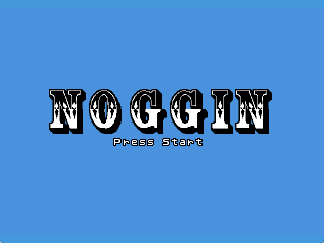
I have design my own UNFINISHED FONTS   I am not quite happy with letters B and D. let me know what You think of it. I having diffcult of doing some letters (which why is not there). cheers |
| Thu, 01 Nov 2007, 21:46 | |
|
mindstorm8191 |
It doesn't look too bad. The black-to-white border with the black background makes it a bit hard to read (and space into your character size). You make want to use the common pink background (full red, no green, full blue), so that your font borders can be more easily seen while you're making the font. But I dunno... I'm no font expert.
-=-=- Vesuvius web game |
|
|
| |||
|
| ||||