
|
Socoder -> Art and Sound -> Which HellFire Fonts do you like? |
|
| Wed, 07 Nov 2007, 18:04 | |
|
Hotshot |
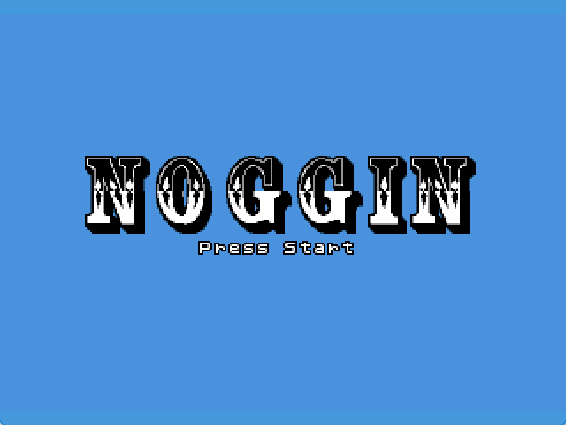
hiya again, Which Title Screen would you choose as there are 4 different Fonts Screen. click the picture to see it better. cheers   cheers |
| Wed, 07 Nov 2007, 18:09 | |
power mousey
|
definitely, the last one. yet it still looks kinda fuzzy... er um perhaps the contrast. the gold or yellowish ones are good, though. 
|
| Wed, 07 Nov 2007, 18:11 | |
|
Jayenkai |
I think the last one, but I'm kinda tempted by #3, too.
-=-=- ''Load, Next List!'' |
| Wed, 07 Nov 2007, 18:19 | |
Forklift_Fred
|
How about a combination then? With just the yellow ones filled in, something like... 
-=-=- Come rain or shine... |
| Wed, 07 Nov 2007, 18:23 | |
power mousey
|
I like Fred's suggestion. 
|
| Thu, 08 Nov 2007, 04:27 | |
|
blanko1324 |
The last one. But, Fred's idea is really good.
|
|
|
| |||
|
| ||||