

|
Socoder -> Web Development -> Site Design : Which is Better? |
|
| Wed, 05 Jul 2023, 00:54 | |
|
Kuron |
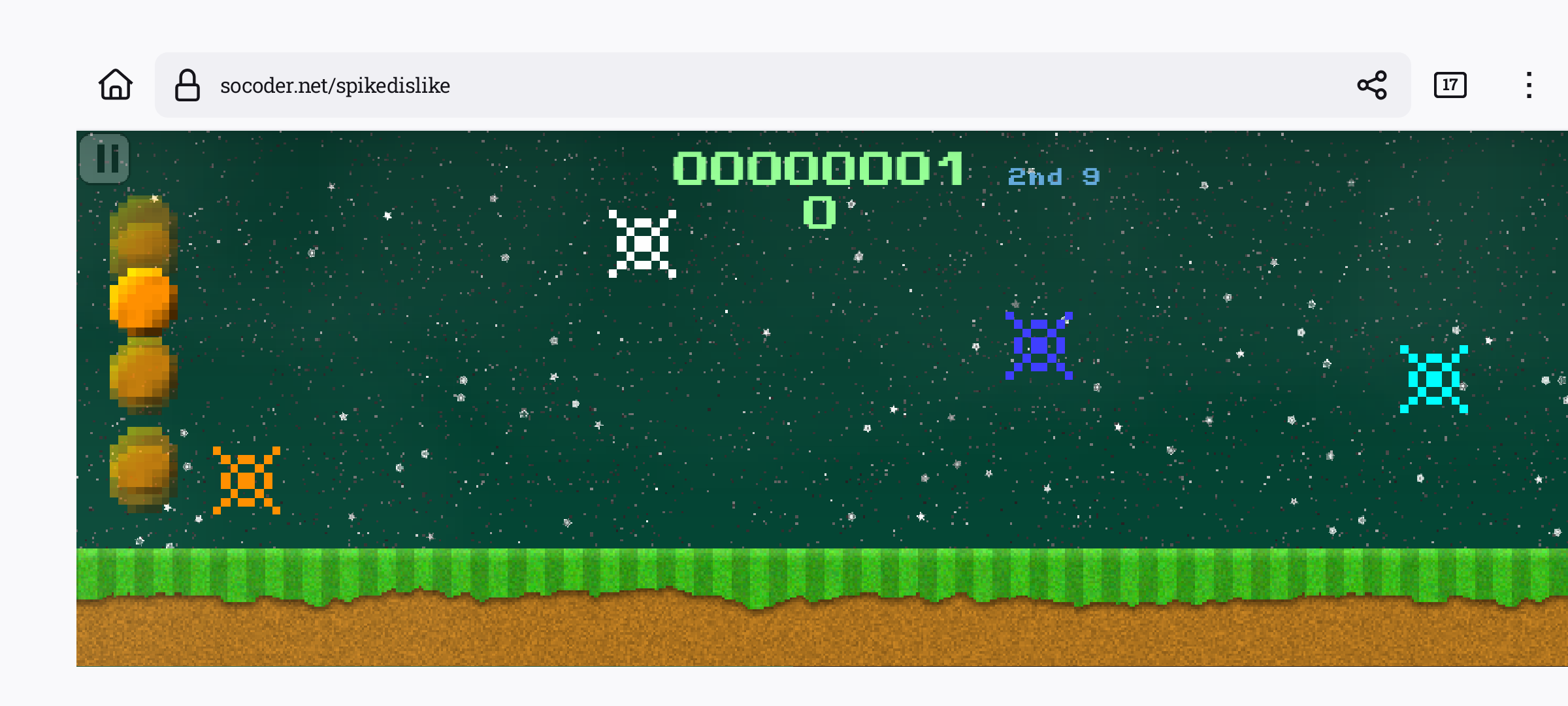
Which do you like better?The white text or the seafoam green text? 
|
| Wed, 05 Jul 2023, 01:38 | |
|
Pakz |
The green is maybe a bit to bright and distracting.
|
| Wed, 05 Jul 2023, 01:50 | |
|
Jayenkai |
I sort of agree with Pakz. When seeing both together, the green looks "highlighted" and that's sort of distracting. If it was all green, though, and not half white, half green, then it might not be as distracting. Maybe a pastel yellow might work better. (Optically, you're using red and green, then can switch to pastel blue for links, so it's a negative/complimentary colour) -=-=- ''Load, Next List!'' |
| Wed, 05 Jul 2023, 02:13 | |
|
Pakz |
Maybe try mix a bit of the other colors into it. Like light does when it hits something and then takes it with to the next object it hits? Blending.
|
| Wed, 05 Jul 2023, 03:41 | |
|
Kuron |
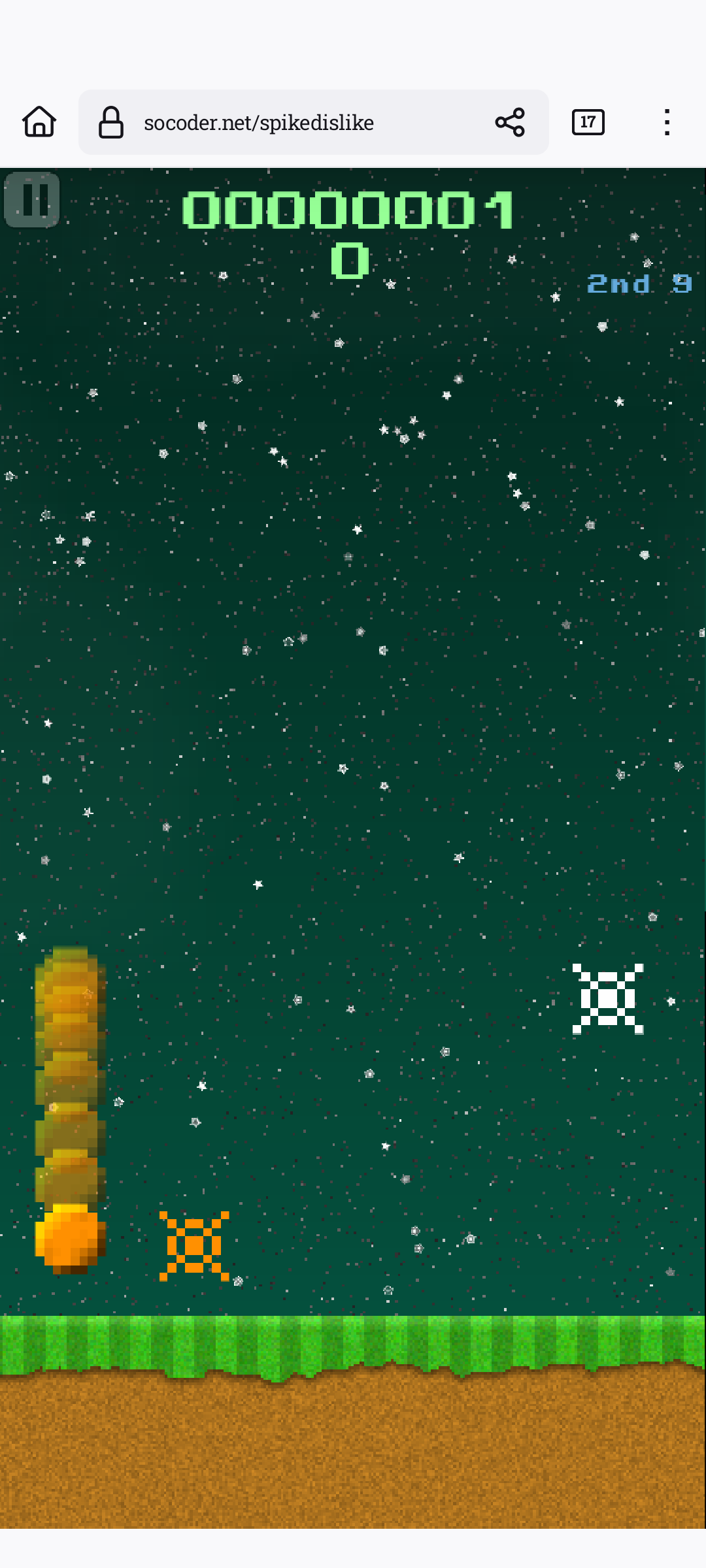
I think I like this subtle green better. No white in this one. Opinions?
|
| Wed, 05 Jul 2023, 03:44 | |
Jayenkai
|
Aye, it's better without the white.
|
| Wed, 05 Jul 2023, 03:59 | |
|
Kuron |
No white in the last one and I changed the green to a subtle mint color. I am going to see if I can get the color scheme going I used on my old site, but I do like this one now. |
| Wed, 05 Jul 2023, 04:48 | |
|
Kuron |
Okies, this is the color scheme for my old site. I think the text color is very easy on that background. But, I may choose the purple text instead of the blue for titles and links Opinions please? 
|
| Wed, 05 Jul 2023, 04:54 | |
|
Jayenkai |
The blue in the twitter icon is brighter than your titles, so my eye is drawn to that.. I'd probably make your title-blue be that colour.
-=-=- ''Load, Next List!'' |
| Wed, 05 Jul 2023, 04:57 | |
|
Kuron |
How about this?  |update| -=-=- |update| As an FYI, that twitter icon and such will not be on my site. Just a frame the editor has when viewing it. |
| Wed, 05 Jul 2023, 05:01 | |
|
Kuron |
I Guess I am liking this one the best: https://socoder.net/?GotoPost=90934 But, obviously, I am biased.
|
| Wed, 05 Jul 2023, 05:29 | |
|
Jayenkai |
You're allowed to be biased. It's your site!
-=-=- ''Load, Next List!'' |
| Wed, 05 Jul 2023, 05:32 | |
|
Kuron |
Is the gray text on the last two images readable on that background?
|
| Wed, 05 Jul 2023, 05:46 | |
|
Jayenkai |
Guess it depends on the eyesight of the reader, to be honest. Make it live, and see if you get any complaints.
-=-=- ''Load, Next List!'' |
|
|
| |||||
|
| ||||||